NYU Skirball

project overview
NYU Skirball partnered with our team to bring one of New York's most fearless avant-garde performance venues online — a digital stage that had to carry the same nerve as the brand itself. The goal was to design a product experience that could serve two very different users at once: people ready to book a ticket in the next five minutes, and people who came to browse, discover, and be talked into a night out. The result is a UX framework built around two modes, Act and Explore, layered on top of a modular component system that lets the Skirball team keep publishing without a developer on call. It's live now at nyuskirball.org.
project type
Website
year
2026
my role
UI Designer
client
NYU


research & strategy
Early discovery surfaced a clear behavioral split in how people actually use a performance venue's site. Some visitors arrive with intent already formed, they want tickets, dates, and parking info as fast as possible. Others arrive curious, with no show in mind yet, and need context, editorial framing, and a reason to commit a whole evening to something unfamiliar. Most arts organization sites quietly optimize for one of these users and let the other churn.
We designed around both from the start. High-intent flows, ticketing, calendar, venue logistics, stay reachable in a step or two from anywhere on the site. For the browsing user, the IA opens into essays, curated themes, and series content that explain why a show made the cut, not just when it's running. A shared taxonomy of themes, genres, and series ties individual show pages back into the rest of the program, so a single event page becomes a way into the wider catalogue instead of a dead end.


design & identity
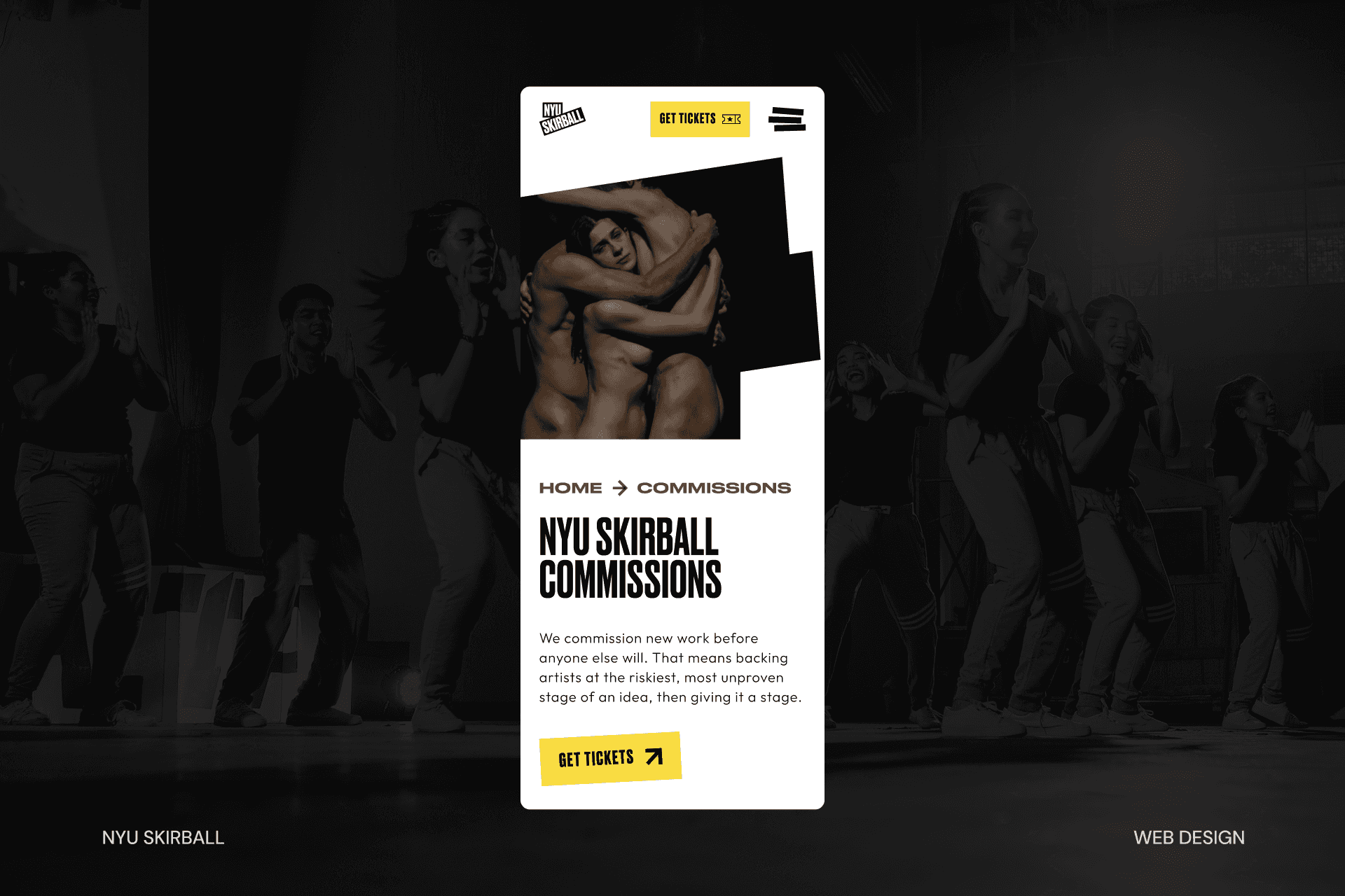
The brand, built by Pentagram, was already bold: high-contrast type, saturated color, a voice that isn't trying to be liked by everyone. My job as lead UI designer was making sure none of that got sanded down in translation to a responsive grid. The layout treats each page like an editorial spread rather than a template, using type scale and motion to carry the same confidence across breakpoints, from a full-bleed marquee event page down to a single mobile FAQ screen.
Event pages in particular needed a tight UX solve: most Skirball runs are short, so date, availability, and next steps had to stay immediately legible without competing with the story and imagery around the show. Motion and hierarchy were used deliberately here, not as polish, but to direct attention exactly where a time-sensitive decision needed to happen.
results & outcomes
The redesigned NYU Skirball site gives one of New York's most provocative venues a digital home that matches its reputation. It:
Serves two distinct user intents — booking and browsing — without compromising either
Preserves a bold, editorial brand identity across every breakpoint
Bridges two separate systems (WordPress and Tessitura) into one seamless user journey
Gives the Skirball team full editorial control through a modular, no-code-dependent component system
Meets WCAG 2.1 AA accessibility standards with mobile-first performance from the ground up