Adler Uniersity
project overview
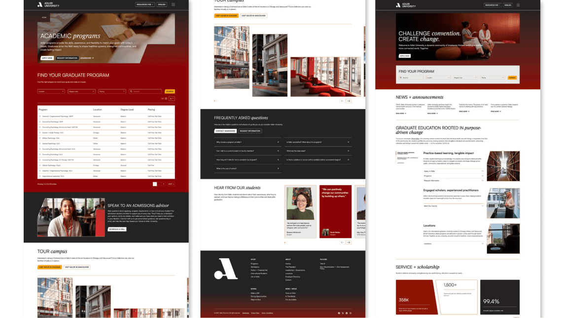
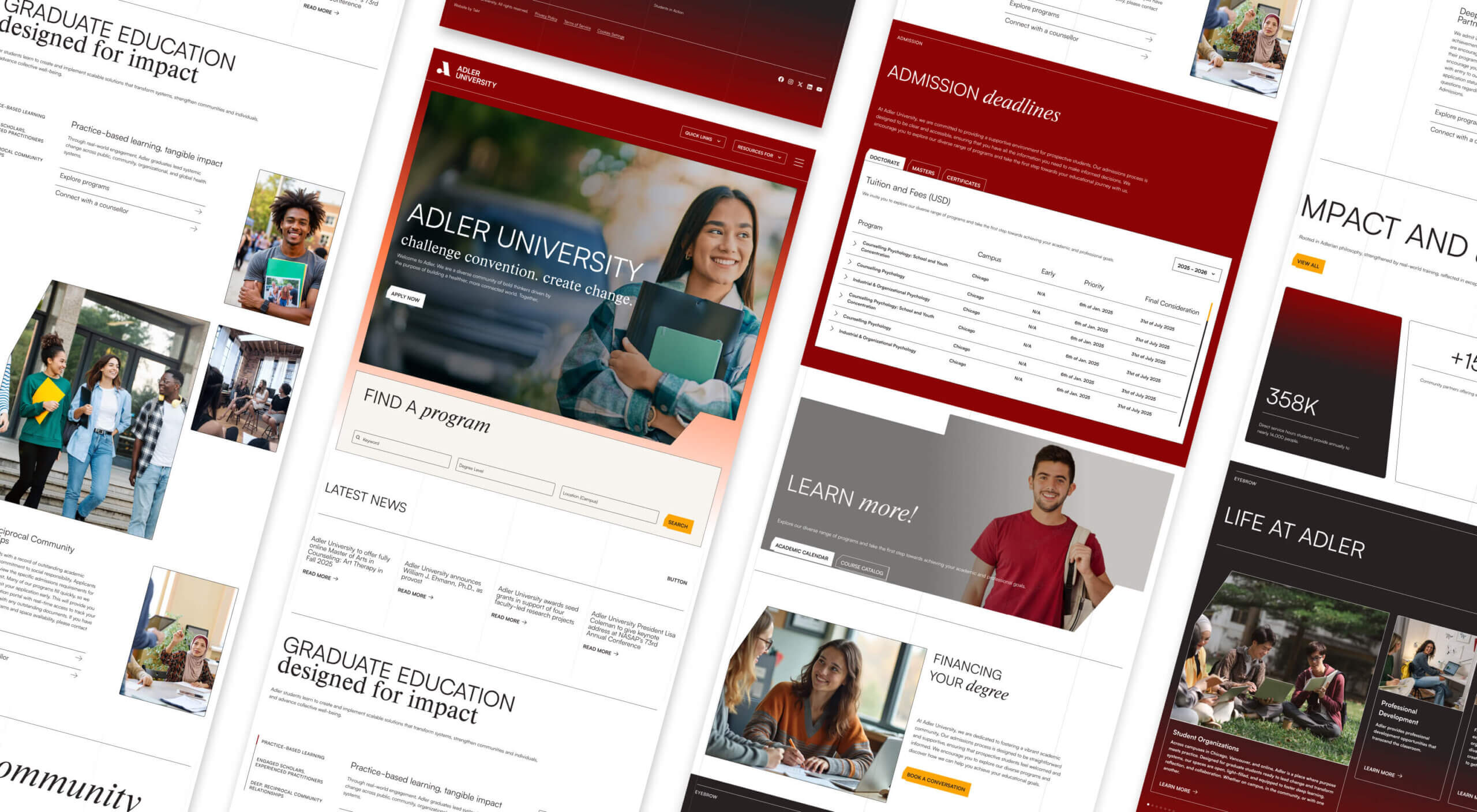
Adler University engaged our team to rethink and rebuild its entire digital presence — unifying multiple campuses, complex program structures, and a legacy academic brand into a cohesive, user-centered web experience. The challenge was to transform a fragmented site into a platform that tells the University’s mission with clarity, supports distinct audience journeys, and scales for future growth
project type
Branding & UI Design
year
2025
my role
UI & Brand Designer
client
Adler University
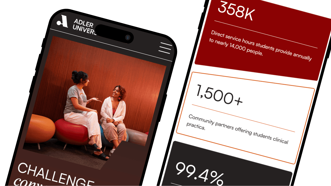
research & strategy
We approached this as both a brand and UX transformation, focusing on:
User journey-first architecture: Reorganizing content around core user needs — students, faculty, alumni, and donors — rather than institutional silos.
Clarity through structure: Simplifying navigation, unifying program pages, and establishing patterns to make depth feel accessible.
Responsive, human-centric design: Balancing academic rigor with warmth and readability, supported by modular components for scalability.
Bridging internal and external needs: Surfacing relevant internal content contextually to connect portal information with public experiences.
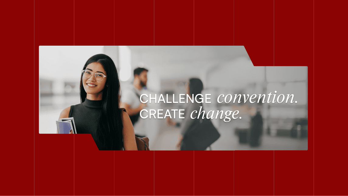
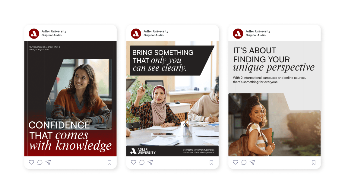
design & identity
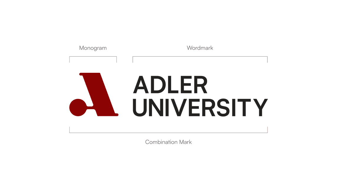
The visual identity for Adler University needed to reflect the institution’s academic rigor, social mission, and human-centered values while feeling modern, accessible, and cohesive across a large digital ecosystem. The design approach focused on clarity and structure, ensuring complex content felt approachable without losing depth.
Typography, color, and layout were used deliberately to create a calm, readable experience that supports long-form content and diverse audiences. A modular design system established consistent patterns across pages, allowing flexibility for varied content types such as programs, research, admissions, and faculty profiles. This systemized approach balanced brand expression with usability, accessibility, and scalability.
The final identity translates Adler’s purpose-driven mission into a digital language that feels confident, inclusive, and durable, supporting both storytelling and functional user needs across devices.